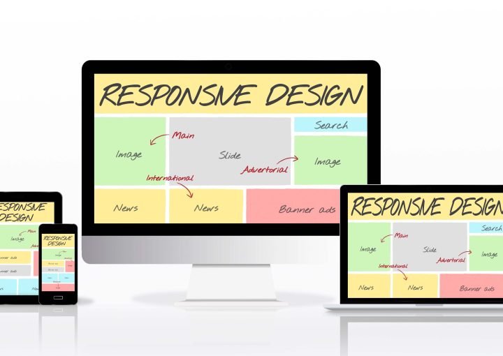
You may get user-friendly and responsive design services from Zimo that are appropriately displayed on all devices. A more straightforward and simple user experience is made possible by a contemporary, clean design. Our goal is to offer completely enticing and responsive design services that will most effectively communicate your marketing message through a clean but simple and flexible design. From tiny enterprises to industry giants, we tailor our services to a wide range of customers.
Responsive Web Design (RWD) is a design strategy that dynamically alters a website’s look on desktop and mobile devices based on various screen sizes and viewing orientations. The goal of responsive web design (RWD) is to create websites that offer a great viewing experience for reading and navigating with the least amount of resizing, panning, and scrolling across a variety of devices (from mobile phones to desktop computer monitors). Today, every mobile user in the entire world uses a smartphone to view websites.

To establish how the site layout will appear, RWD employs breakpoints. Above the breakpoint, one design is utilised, and below the breakpoint, another. breakpoints determined on the browser’s width.
For its clients, e-responsive Zimo’s web design competence and ten years of web application development experience have produced positive results. By offering the same user experience and user interface (UI) across devices without adding any more costs to the project budget, it enables its clients to benefit from the most recent rise in device availability. In the shortest amount of time, this has produced a positive ROI.
We are a partner of choice for all responsive web design projects for web apps and websites because of our comprehension of the customer’s project vision, procedures for good communication and project execution, and added edge when it comes to UI and user experience.
Adaptive Design
Graphic designers at Zimo produce expert GUI designs and content that adapts to various screen sizes with ease and fluidity. They possess the know-how to scale components in proportional units while using media queries, allowing the designs to automatically fit on the browser area to guarantee content consistency and cross-platform compatibility.
Designing a responsive website
Our professionals use a method to ensure that web pages display correctly across a range of devices and screen sizes. We also provide careful consideration to the viewer’s proximity, which is a component of the RWD extension and viewing context.
Mobile-responsive web design
Our team at Zimo adapts the 12 necessary steps needed to make your website mobile-friendly. For the greatest experience for our clients, we make sure to include a number of key elements, such as giving simplicity, removing text-blocking advertising and pop-ups, and presenting information that is simple for visitors to understand.
On any device, anywhere
our website will be accessible on all devices thanks to responsive web design. The most exciting element is that this will happen even on wearable technology, such smartwatches, because it will format your website design and allow you to show your content in the best possible way.
Comprehensible and Condensed Information
The current trend is moving toward mobile-first designs, therefore you should make sure that your website is mobile-friendly. All the specific information is carefully condensed and presented on your website by Zimo in the most effective and efficient way possible.
Utilize modern technology
We build competent websites using the most useful and cutting-edge technology as a top responsive web design company. We from our web page design company can create attractive and highly effective websites for our clients by utilising the most recent technology. We pledge to provide the greatest service and will only do it using cutting-edge technologies.
Fine-tuned Codes
We have not used Flash for a very long time. Instead, we build your adaptable websites using the most flexible and sophisticated programming and languages on the market. We employ computer languages to provide clients flexible media retrieval and automated webpage scaling, both of which are in great demand.
Modesty and Style
The relationship between responsive web design services and clean, contemporary site designs is well-known. It is no longer encouraged to use large visuals and buttons that are out of alignment with the text on the page. Instead, we use such user-friendly site designs so that visitors may enjoy and continue to be interested.
Enhanced Images
The pictures are viewed in relation to the size of the screen when the responsive websites are visited. Considering that pictures also automatically resize and reformat themselves to fit neatly on the screen, it is possible to resize a web browser window to fit on a phone screen while maintaining the high resolution and clarity of the image.
The principles of responsive web design are built on moving items around the page throughout design and development. The challenge can also be solved via responsive website design. the best way to rearrange components on wider pages to fit on narrower, longer pages, or the opposite. More important material is displayed on mobile devices than on desktop computers. Making ensuring that everything fits on a page is not sufficient. Additionally, responsive may be used with any screen size or resolution.
Now, thanks to responsive design, all online pages appear incredibly gorgeous on smartphone, tablet, and desktop. All are quite user-friendly. Due of the additional expertise and grid system tool required, it costs more than a plain website. Making everything professional is a standard.
The most recent versions of HTML5, CSS, and JavaScript serve as the foundation for responsive web design, which includes capabilities like media queries that can identify a browser resolution and CSS scripts that can adjust items to a specific device’s layout. When creating a responsive website, measurements are specified as percentages so that the design may fluidly change to fit the size of the browser window.
We successfully converted a mobile-enabled website into a mobile-optimized website for one of the projects, enabling it to function on iPad, iPhone, and Android smartphones with enhanced navigation and user experience.
